This is the script with references and acknowledgments of my talk at the If Book Then Conference held at Intesa Sanpaolo in Milano on May 23rd, 2014.
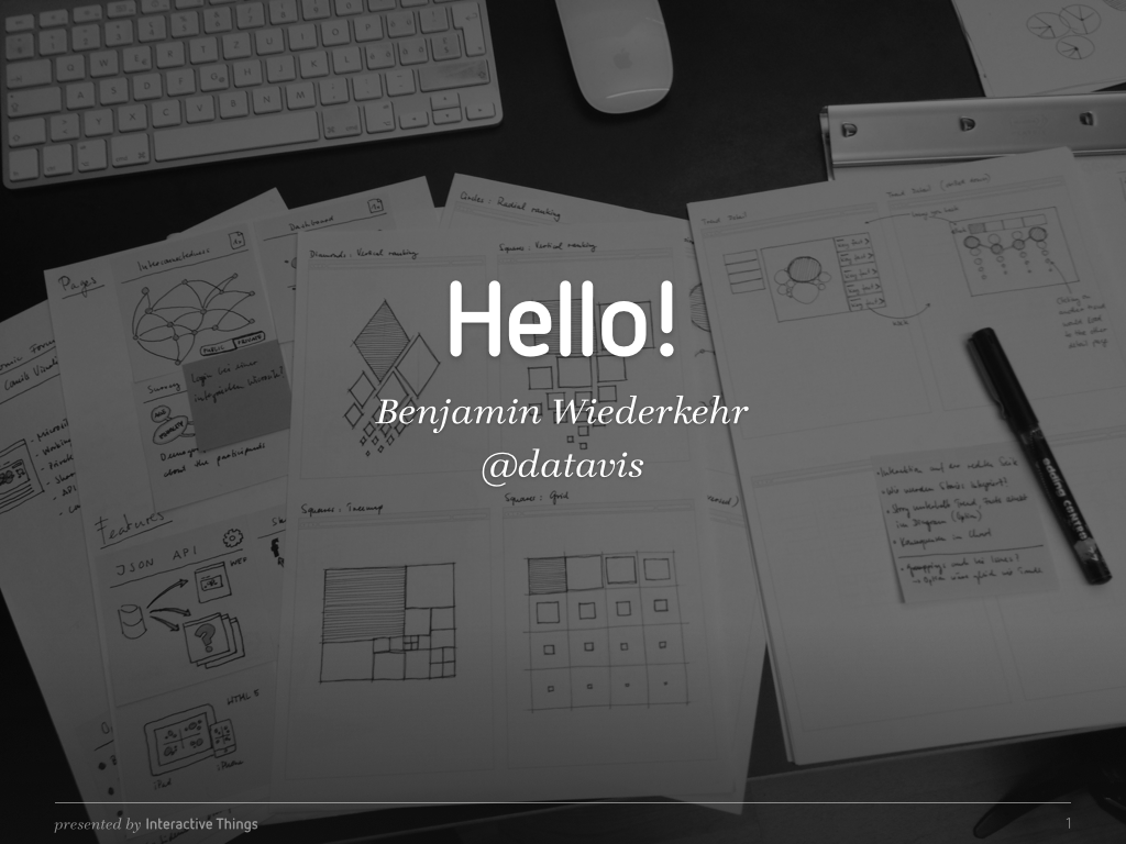
Hello, my name is Benjamin and I'm an interaction and information designer from Zürich, Switzerland.
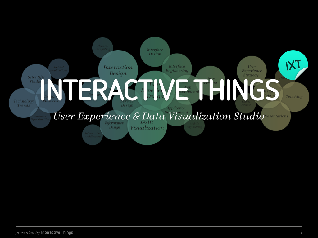
I am co-founder of a small design studio called Interactive Things and we're focused on User Experience and Data Visualization. I have the pleasure to be with you today representing my friends at the studio Christian, Christoph, Estelle, Ilya, Jan, Jeremy, Julia, Peter, Piotr, and Tania. It’s an honor for me to be here.
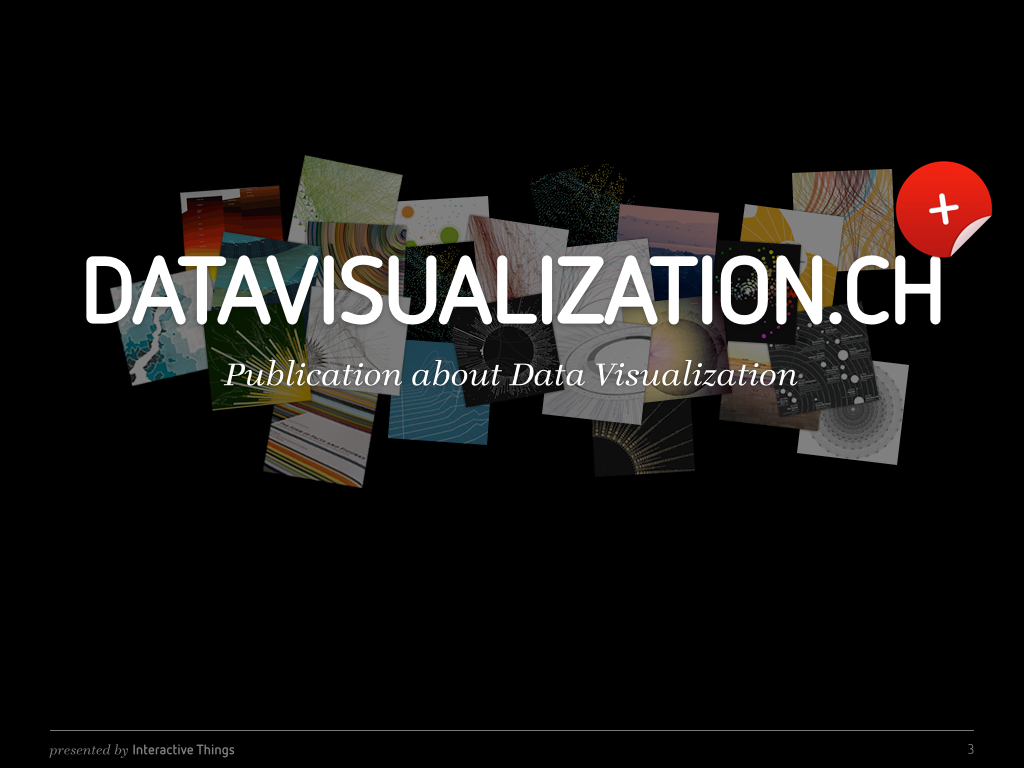
For six years now I also write about information and visualization design on a website called Datavisualization.ch. It’s a place for me to I document, publish and discuss my findings from my academic and applied work and research.
When I was asked to speak at this conference about Telling Data-Driven Stories alongside this fantastic line-up of speakers that have so eloquently talked about telling stories, I got slightly nervous. I personally enjoy stories just as much as everyone else. Sometimes I even enjoy telling them myself. After all, creating a design solution is telling the story about content, functionality, and behavior of products.
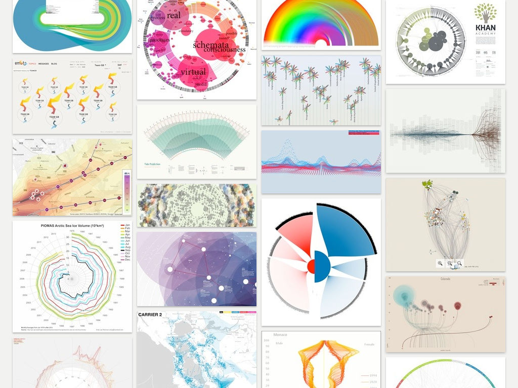
But still, when I look at our daily work, I understand our role to be the one of a craftsman rather than the one of an storyteller. In most of our projects, we help people to analyze data efficiently, to understand information intuitively, and to apply their knowledge confidently. We are the builders of instruments to overcome his human limitations. We are the engineers of vehicles that transport him into foreign territory. And we are the drawers of maps to help him navigate once he gets there. This way, we create the Atlases necessary to understand the world from thousands of different perspectives. These shown graphics are created by people outside our studio.
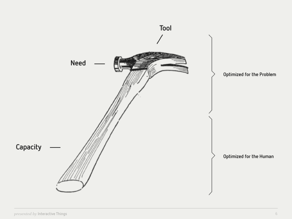
A tool is an artifact to amplify the human’s capabilities. It’s that’s optimized for the human handling it, as well as the problem domain where it gets applied. Inspiration for this conceptualization of the tool comes from Bret Victor
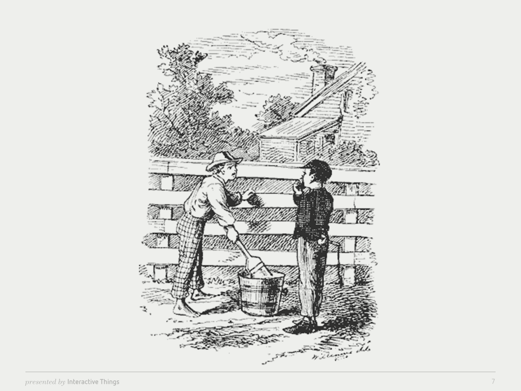
A story, on the other hand, is the chronology of events in a narrative enriched through the discourse, manipulation of that story in the presentation of the narrative. Or in plain english: A tool is a thing that helps us to solve problems that we can’t without it. And a story is something that slaps you in your face so that you’ll remember it 2 hours later, or two weeks, or two years.
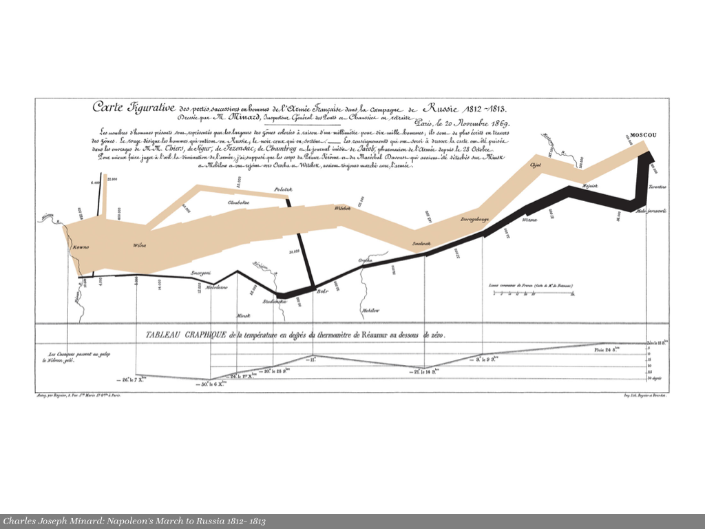
Let’s keep this in mind when we look at a very prominent example of information visualization that all of you will recognize: This is the map showing Napoleon’s march to Russia by the great Charles Joseph Minard. But, what's the story that Minard's map is really telling us? This visualization has been promoted and discussed in great detail by Edward Tufte.
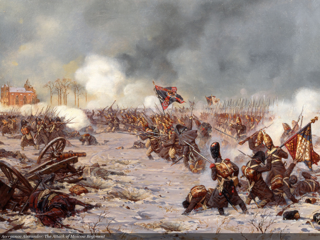
My question is, does it tell the story of thousands of soldiers who died in battle, drowned when crossing the river Berezina or starved to death? Or does it tell the story of a huge number decreasing over time and location?
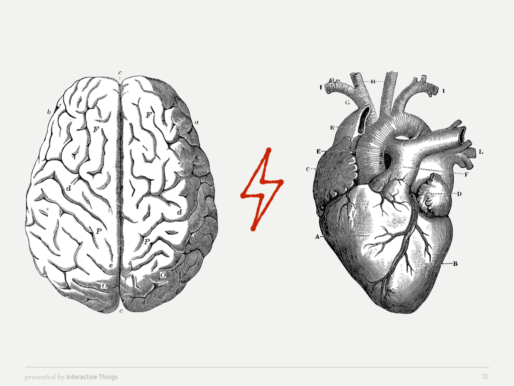
It seems to me that this example speaks the language of the brain. Connecting to our capability of rational reasoning. It does not obviously connect with our very human self. It does not intuitively speak to our hearts.
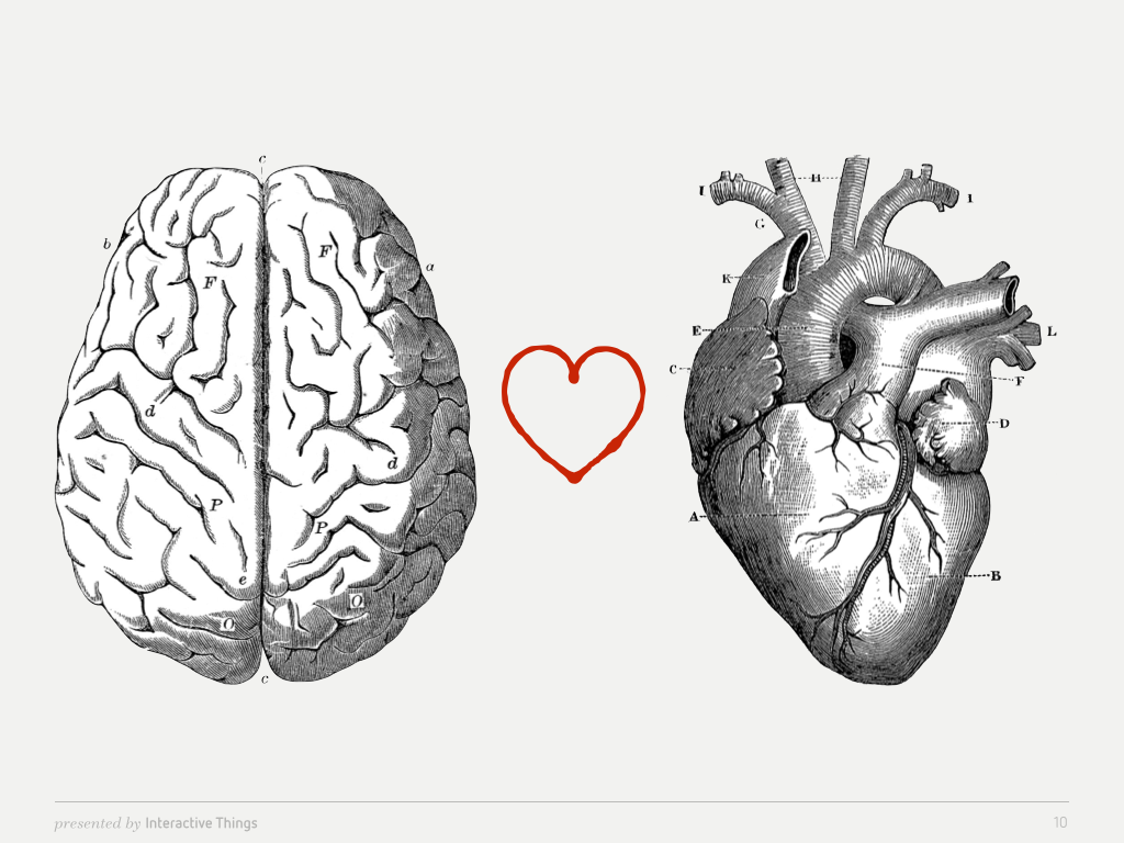
But what if we could speak to both sides? What if we could satisfy the need for the analytical and the desire for the emotional?
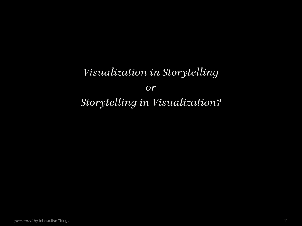
First, I realized that there are two different concepts flying around: Visualization in Storytelling and Storytelling in Visualization. The first uses information visualizations as part of a story and the second uses storytelling principles when creating information visualizations.
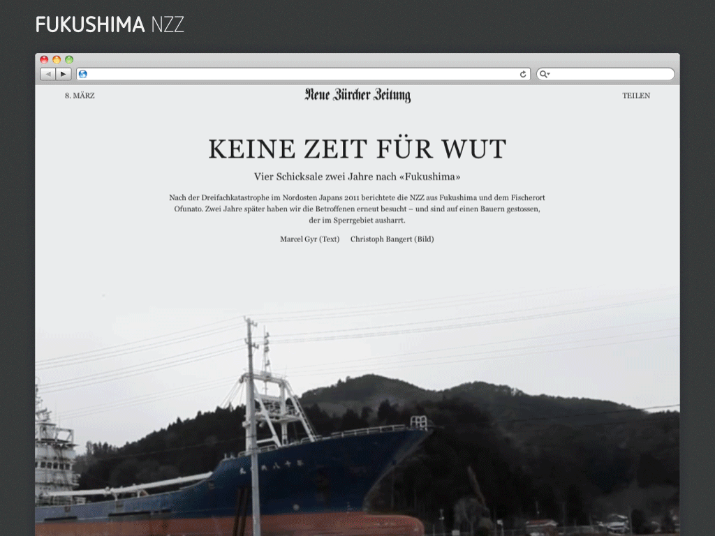
In the first example we explore the possibilities to support a story told as a long-form, multi-media report with visualizations. It’s the result of a collaboration between the wonderful people from Neue Zürcher Zeitung and Interactive Things. It’s called «Keine Zeit für Wut» or «No Time for Anger».
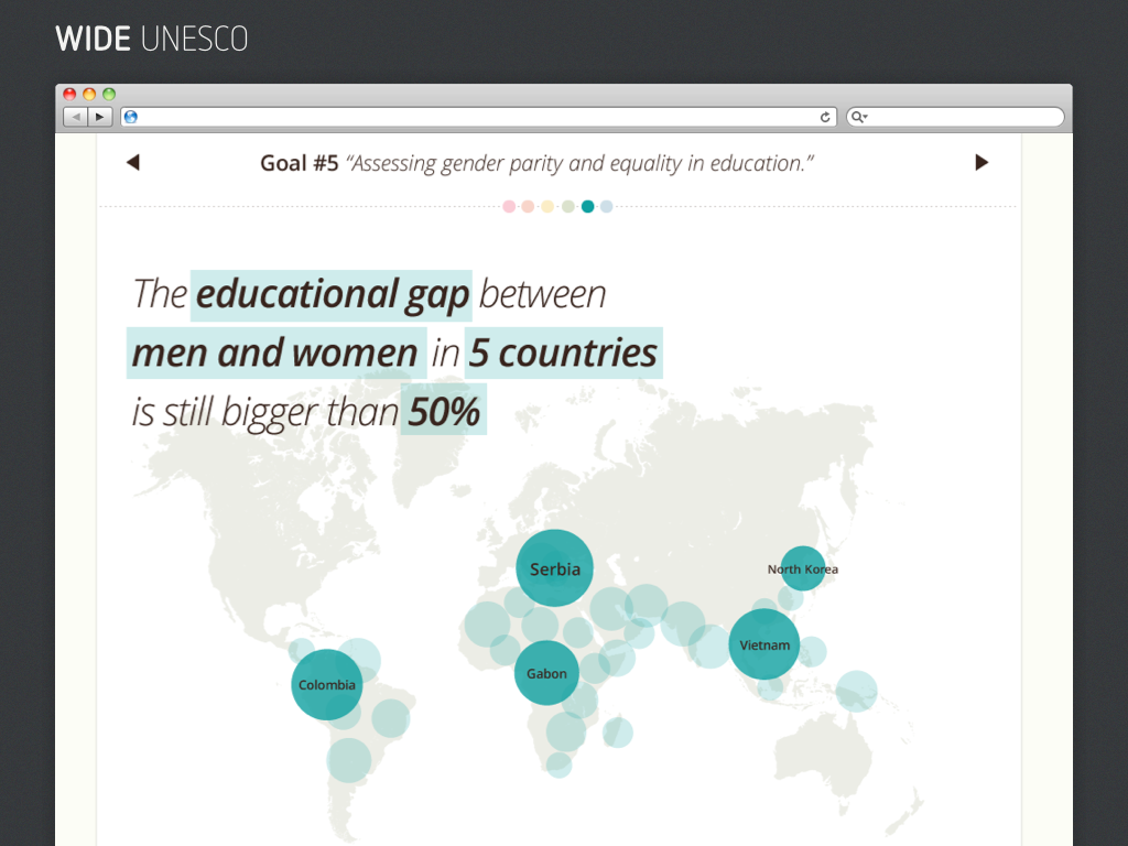
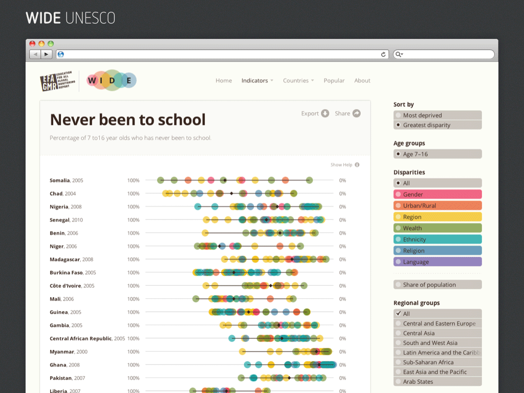
The second example is a large-scale data exploration platform and it’s the result from a collaboration between UNESCO and Interactive Things called WIDE. We did provide a data-driven narration as the entry point for first-time visitors. The stories center around the six Education for All goals. Based on the actual data we are able to tell the reader the current state of affairs while UNESCO is working towards reaching these goals. These stories are just a tiny parts of the knowledge to be acquired from the complete data set. But they are starting point. A first insights that opens up a world, ready to be explored freely by the user.
And so, I have to ask myself the same question. What story do we tell with the WIDE project? Do we tell the story that if you’re, born in Somalia, as a girl, in the South East of the country, in a rural region, and if you grow up in one of the poorest households, that you have a 99% chance of never seeing a classroom from the inside? Or do we tell any of hundreds of other stories embedded inside this vast data set that wait to be discovered and interpreted by users? Who narrates them? Where are they exemplified?
And it’s so great that Frank spoke about stories like Star Wars, Lord of the Rings or Avatar. These stories don’t just line up events chronologically. They introduce us to places like Middle-Earth or Pandora. They establish whole worlds. Worlds to be explored by both, the protagonists and the audience. This way, we turn our audience from being mere consumers, passively listening to all the exiting stories we can tell them, into participants, who learn to enjoy data exploration the way we do. Why is this important? Well, there are two reasons.
First, we must keep in mind that data and the visualization thereof is not equal truth. No world-spectating device is a neutral technology. Just like with photography, there is always a human behind the device, making decisions. How far do we zoom in? What is the focal point of the image? Out of hundreds of shots, which is the one we publish? A photo is never an objective reflection, but always an interpretation of reality. This is an important point to keep in mind and it rings true for visualization just like for photography. So, we want everybody to become a critical consumer of information. A lot of this thinking is inspired by Moritz Stefaner and his wonderful article Worlds, not stories.
Second, no knowledge sticks as well as the self-created knowledge: after a first hunch, to look further into the evidence, maybe pondering counter-evidence, and finally formulating a specific, grounded belief — this is the type of knowledge you will never forget. To make best use of this, we would like to facilitate an active information discovery. Probing a possibility space, trial and error, action and reaction. That’s the way how we learned all our basic knowledge when we were infants, and interactive visualizations can help us train that muscle.
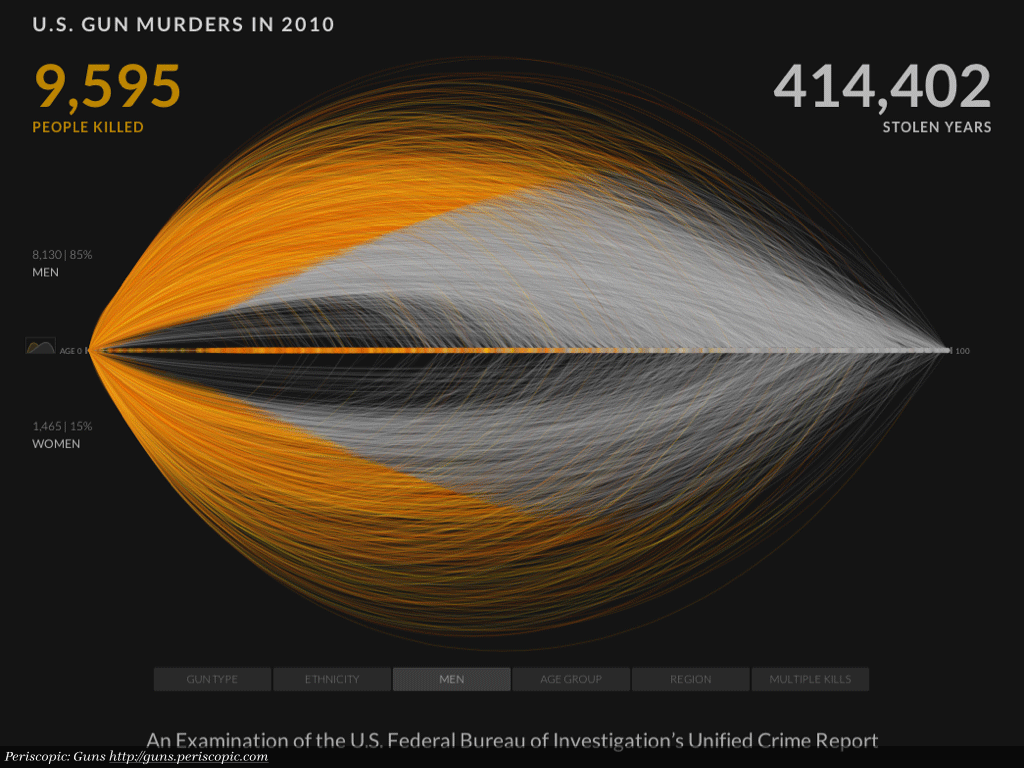
Created by Periscopic, the Guns visualization introduces the user to the devastating data set about fatalities in the USA due to hand guns. After an initial animation, the user is free to explore the data set and filter, select and get more details about individual data points.
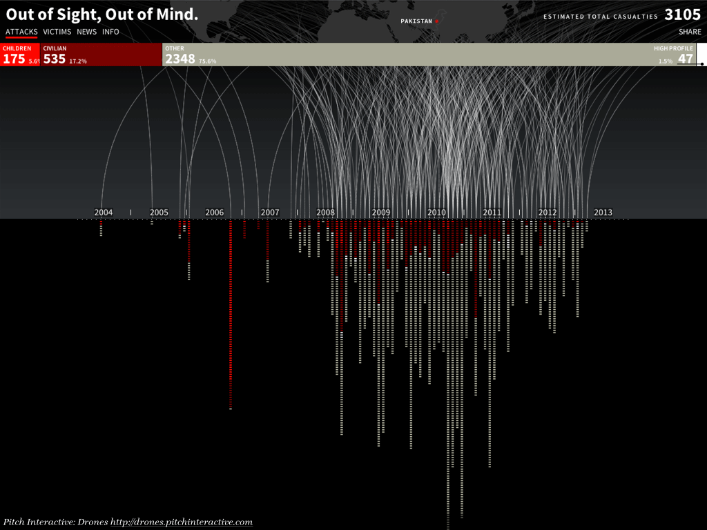
A second example of such an opinionated introduction has been created by Wes Grubbs and his team at Pitch Interactive. The Drones visualization represents the intensity of drone strikes over the course of the past 10 years and the resulting fatalities.
These two examples, done by friends of ours over the course of the past year, have experimented with the notion of narrated, opinionated introductions. Some have called this data dramatization and it’s hard to disagree. The data truly becomes much more visceral in this directed representation.
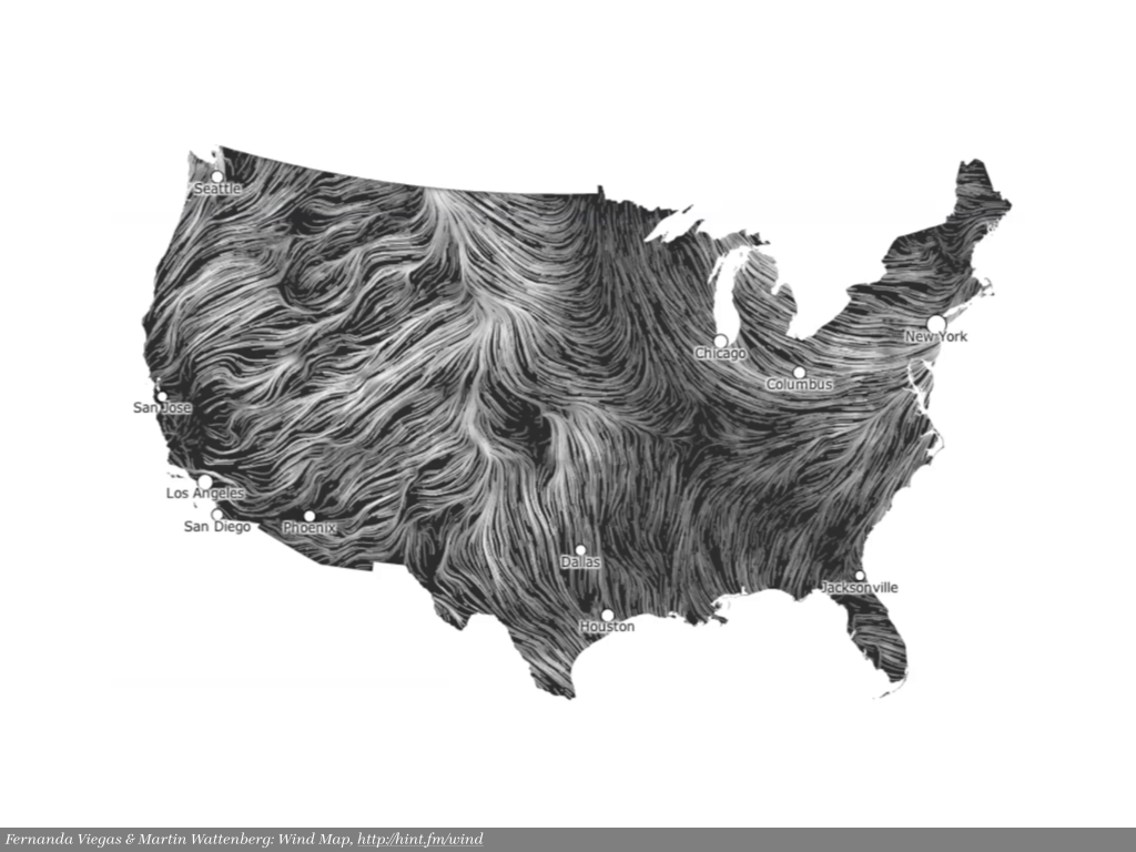
Another example, from the Google Data Art team around Fernanda Viegas and Martin Wattenberg, doesn’t need a strong introduction to tell a striking story. Actually, it doesn’t tell a very strong story during most times of the day. What we see here is the direct mapping of wind across the North American continent. We see flows and varying densities. But that’s all.
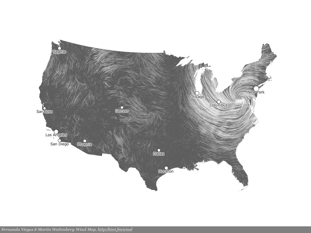
But when we jump back in time around December of 2012, the map tell a very strong, memorable story about a storm that costed lives.
Sometimes less explicit stories, less obvious narrations create a stronger, longer lasting impact on people. Think about the last time when you read book first and then watched a movie based on that same story. While you read the book, your mind filled the world with visuals. Your mind closed gaps that were left open by the author. It was your story. Your perspective on it. When you watched the movie, it was someone else's story. Someone else's perspective. And you had to oblige to it.
Thank you!
Big thanks to Serena, Marco, Silvia, and Titta for the invitation to speak and the seamless organization. Frank, Richard, Michel, Dorothy it was a pleasure and honour to speak alongside all of you.